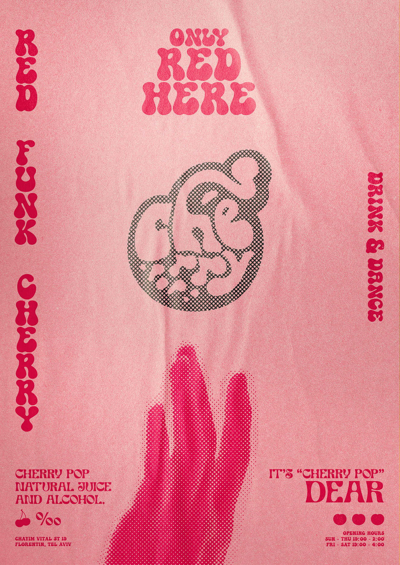
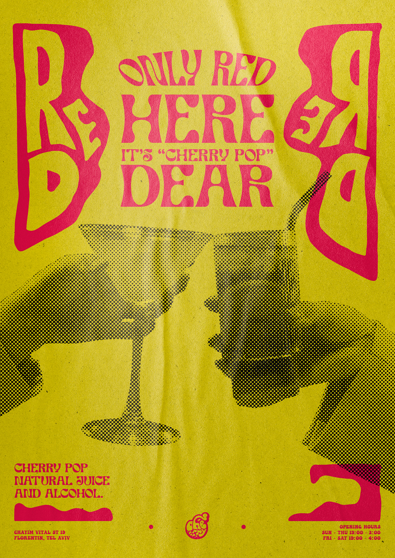
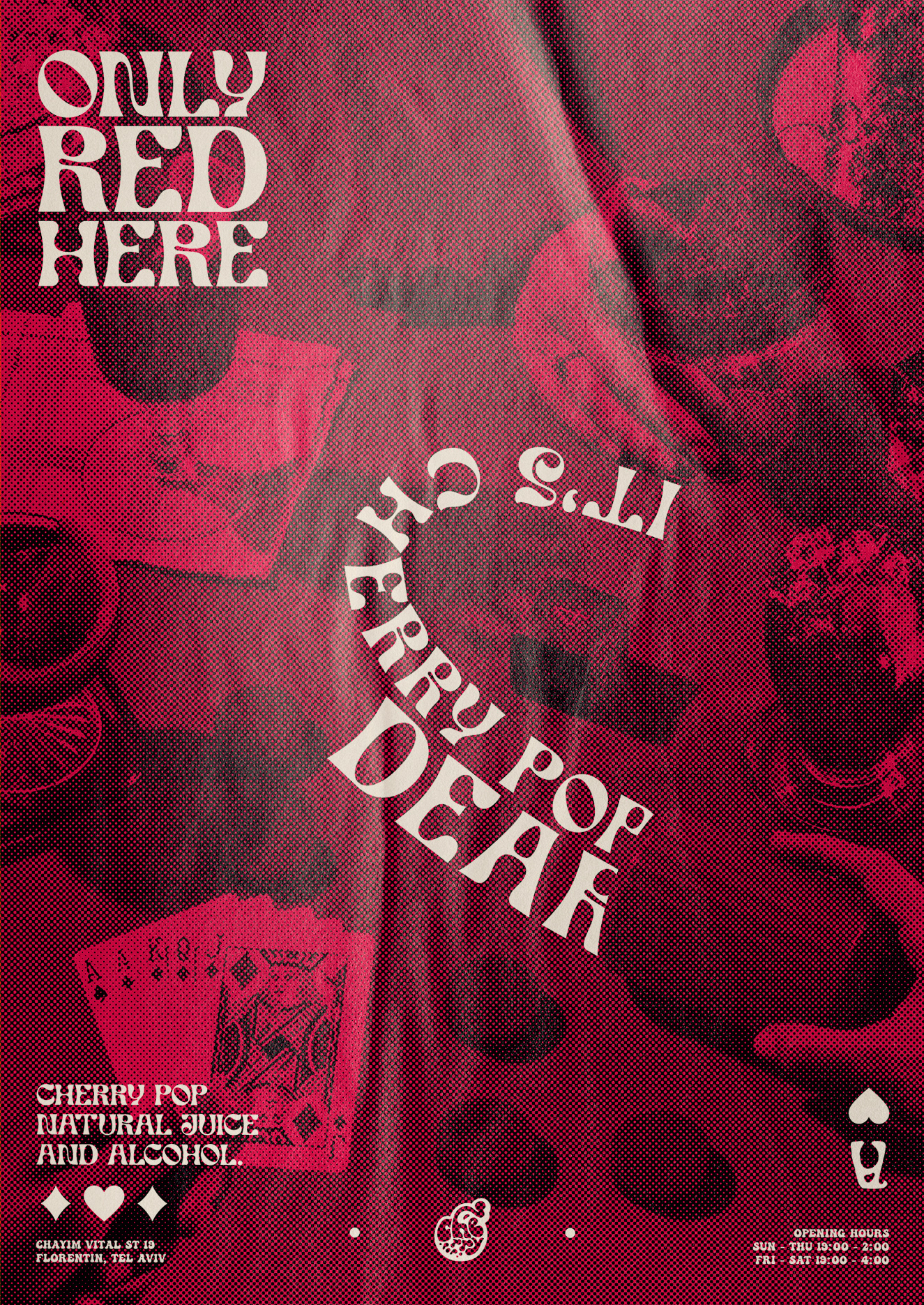
Branding for Cherry Pop. My task was to take such a regular product as juice and create an eye catching identity. So first of all I decided that juice and fruit itself is something energetic, sweet, playful and sexy. That's how I came to the name cherry Pop. Using 100% natural juice, (red color juice only!) mixing it with a small amount of alcohol, making easy and fresh cocktails with organic juice and taking all these things to the disco world of 80's. As a result Cherry Pop became very bold, funky, young and eclectic but still devoted to the eighties brand.
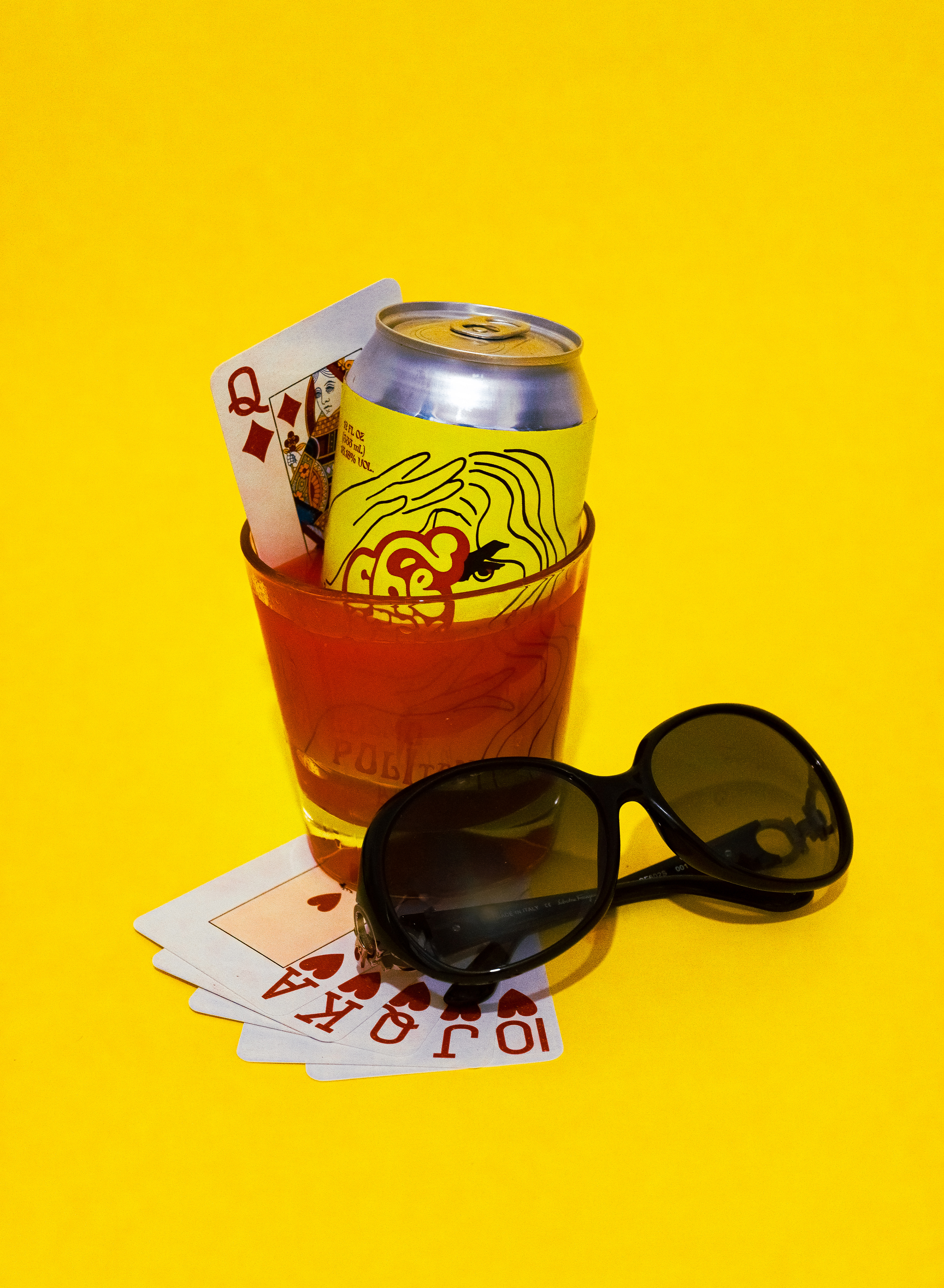
Only red here. It's cherry pop, dear!
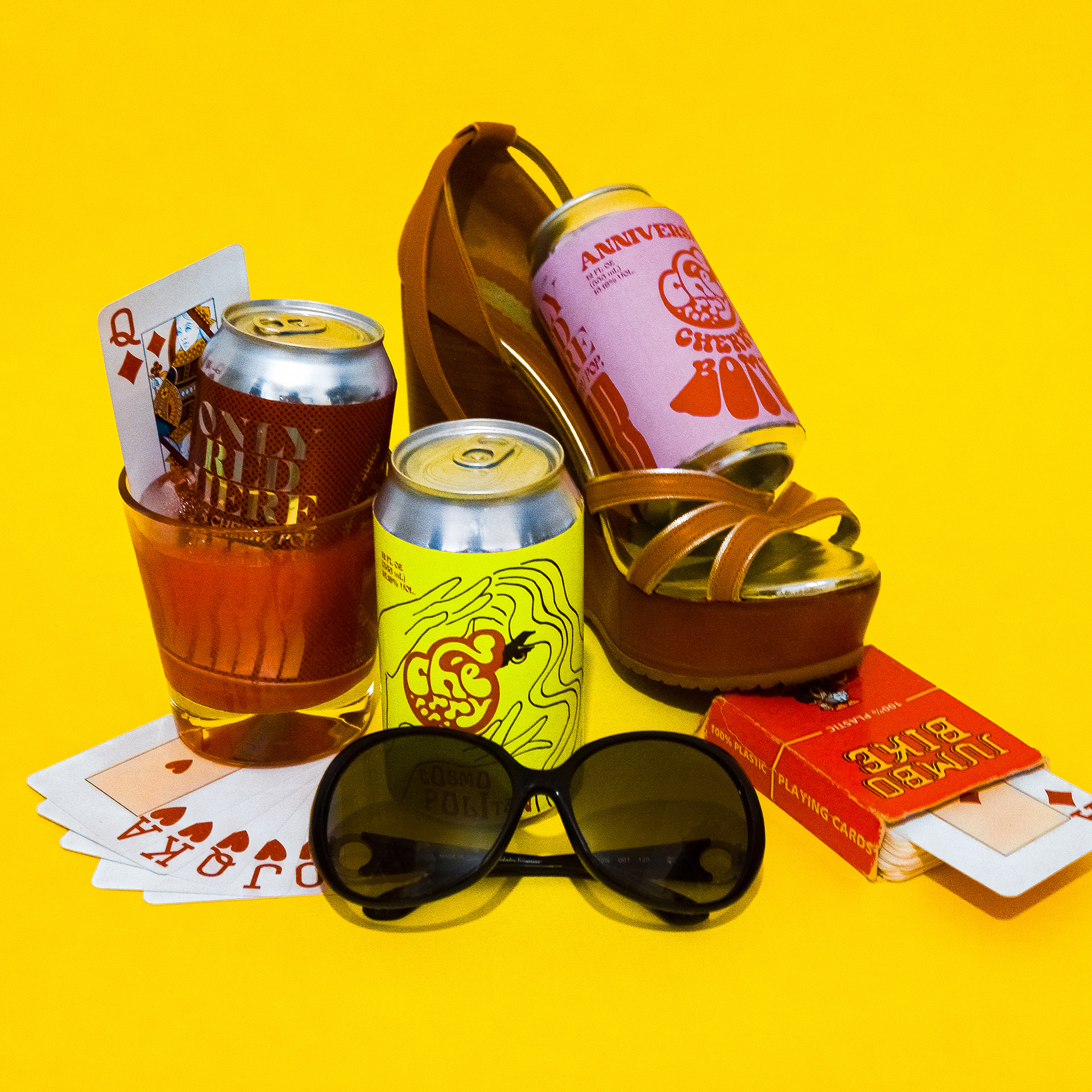
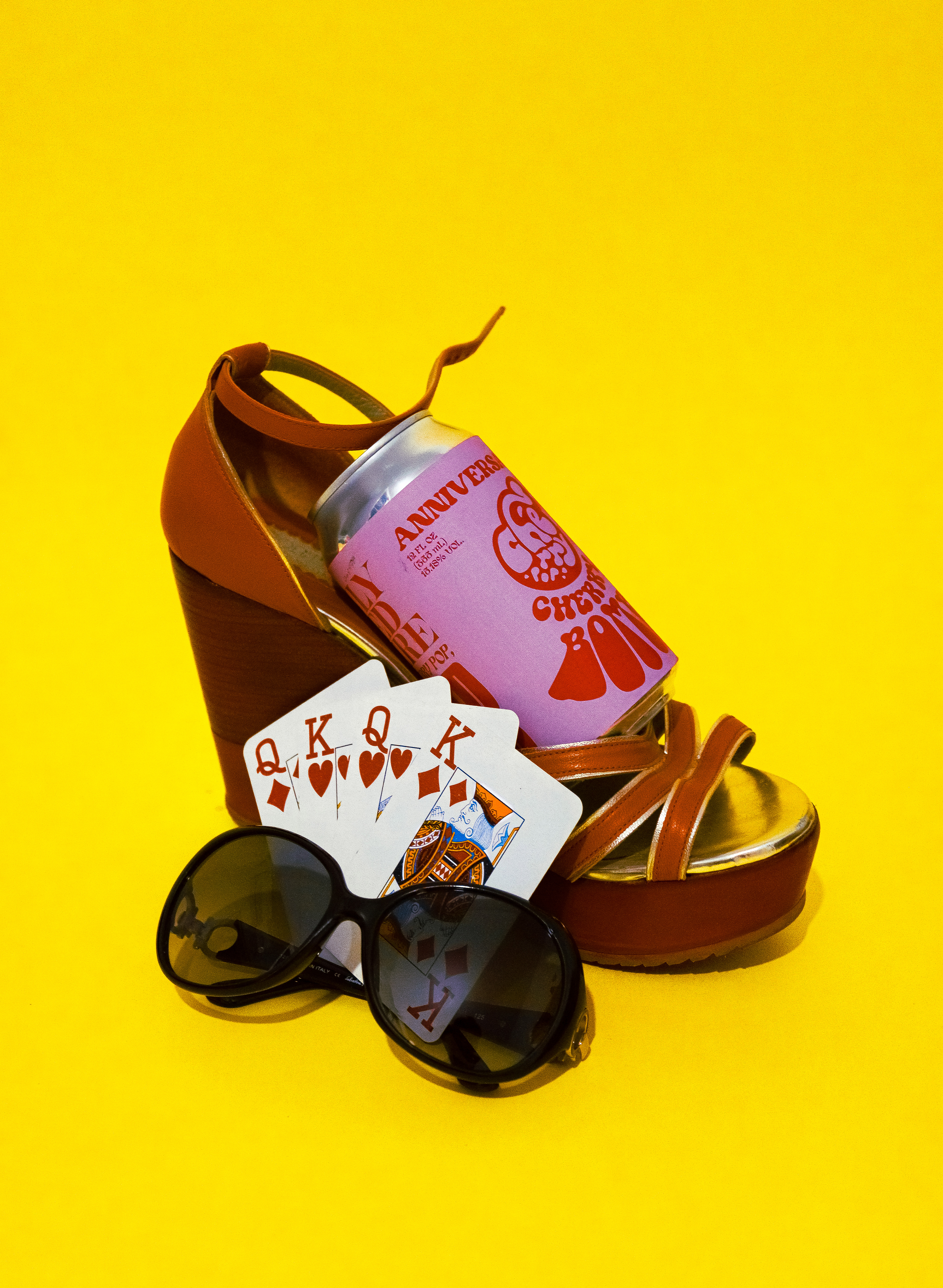
Three 80's stylized photos of the final product for ads.
Posters for Cherry Pop.
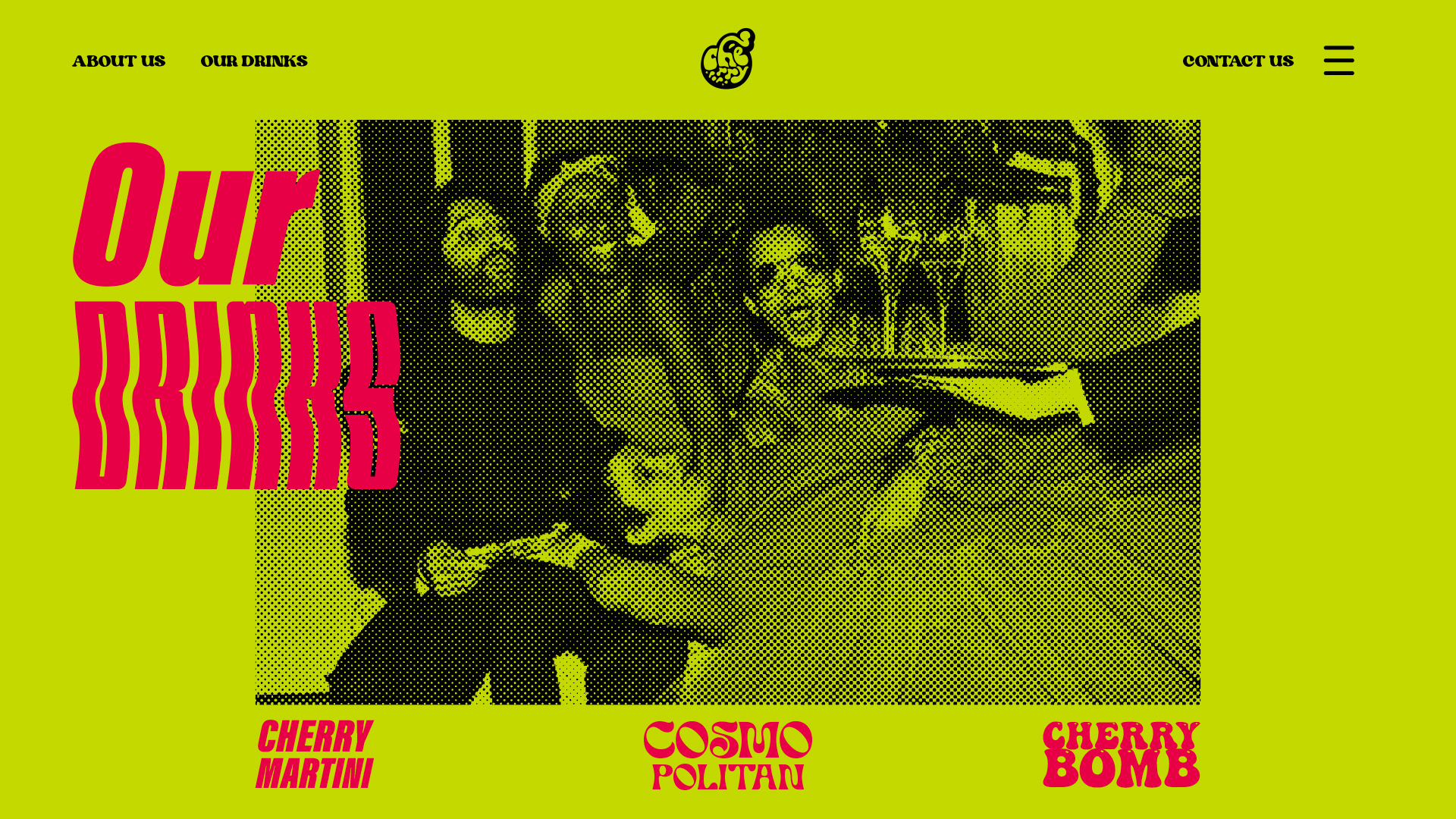
An example of web site landing page design.