Brief: To create a self-portrait through 9 motion graphics squares. Each square should interestingly and successfully display the word it is based on, and all nine squares should work together cohesively, considering color palette, graphic and conceptual quality, and animation level.
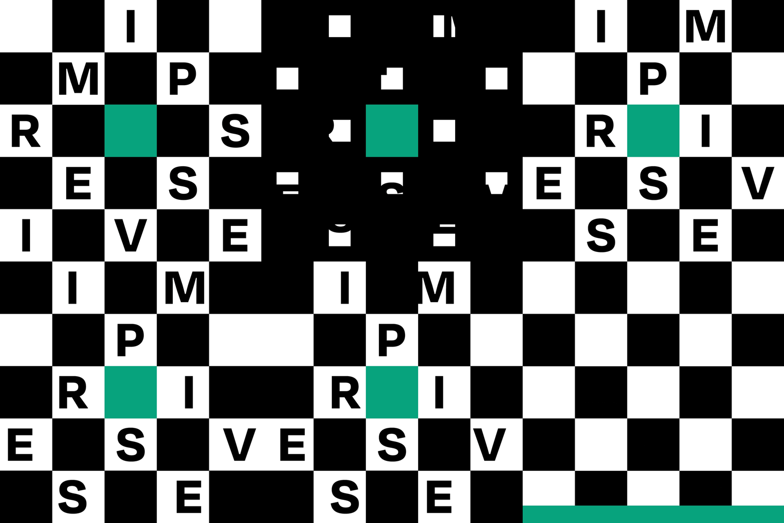
I can describe myself with many words and the first square taht I made was tough. There is also a symbolic meaning in this visual image. While thinking about design I can't think about soviet constructivism and works of soviet masters of poster. At last that's what everyone is waiting from you the second after they realize that you are from a post Soviet country - being tough!
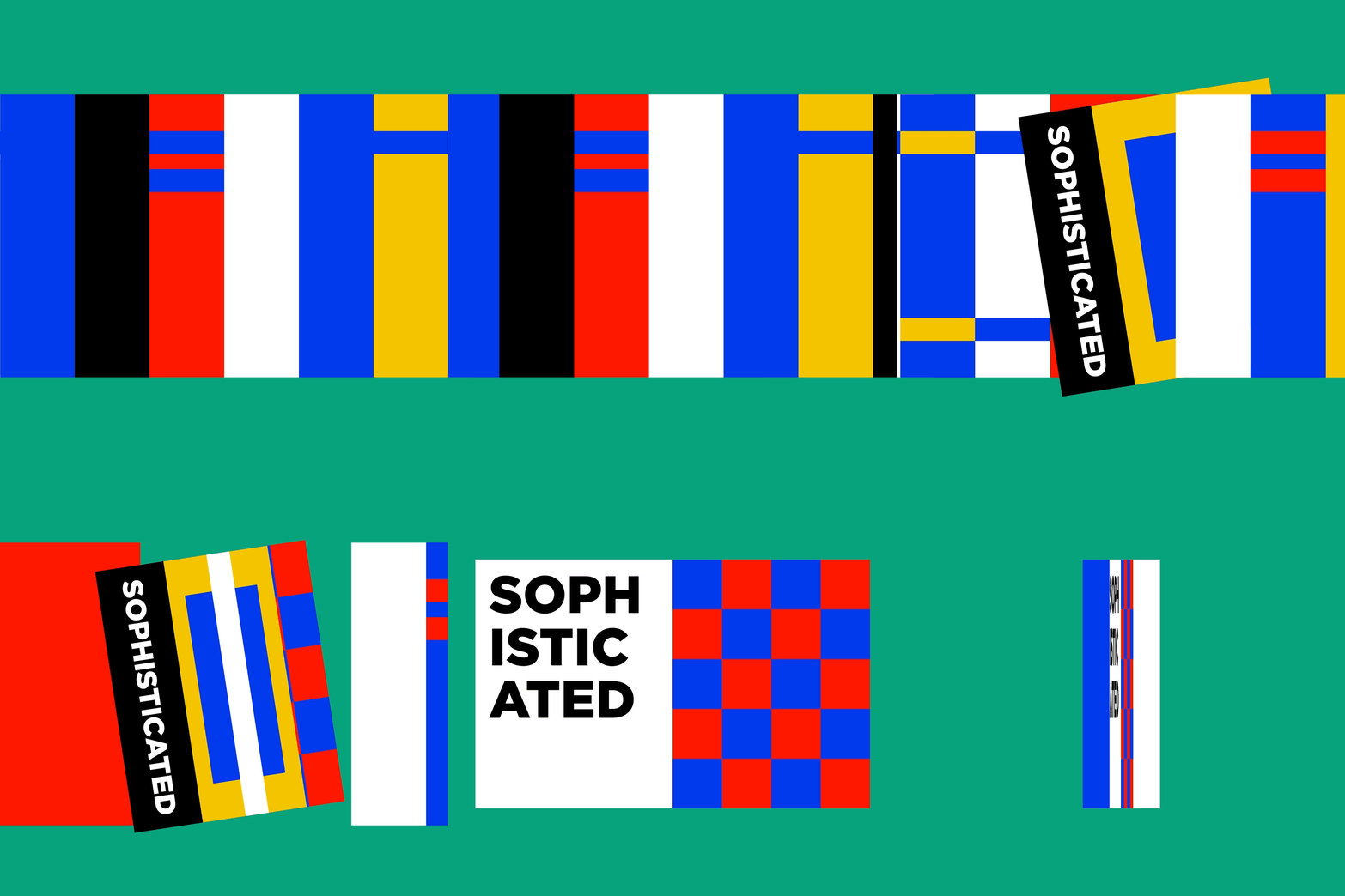
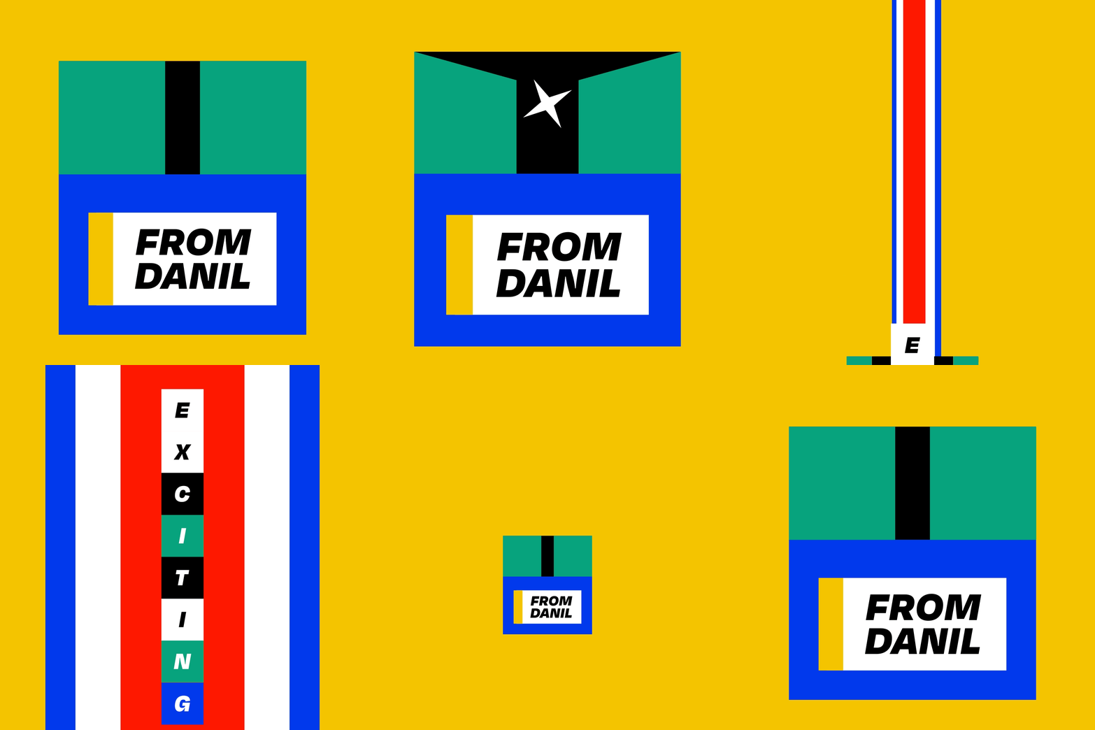
From the first square I was sure about the forms but still not sure about the color palette. To create a color palette that I was looking form I came to De Stijl. But I still wanted to create a feeling of something less ideological but modern and playful and also showing that good desing don't demand a lot like the two styles above-mentioned. I decided to create a solid visual language with restrictions and rules. Simple and recognizable forms, solid san serief typography, bold colors and fast modern animation, in my opinion these are the main ingridients to make a good visual design. At last, that was my main goal and a way to describe myself in one sentence: making a bold and unforgettable experience from the first second.


